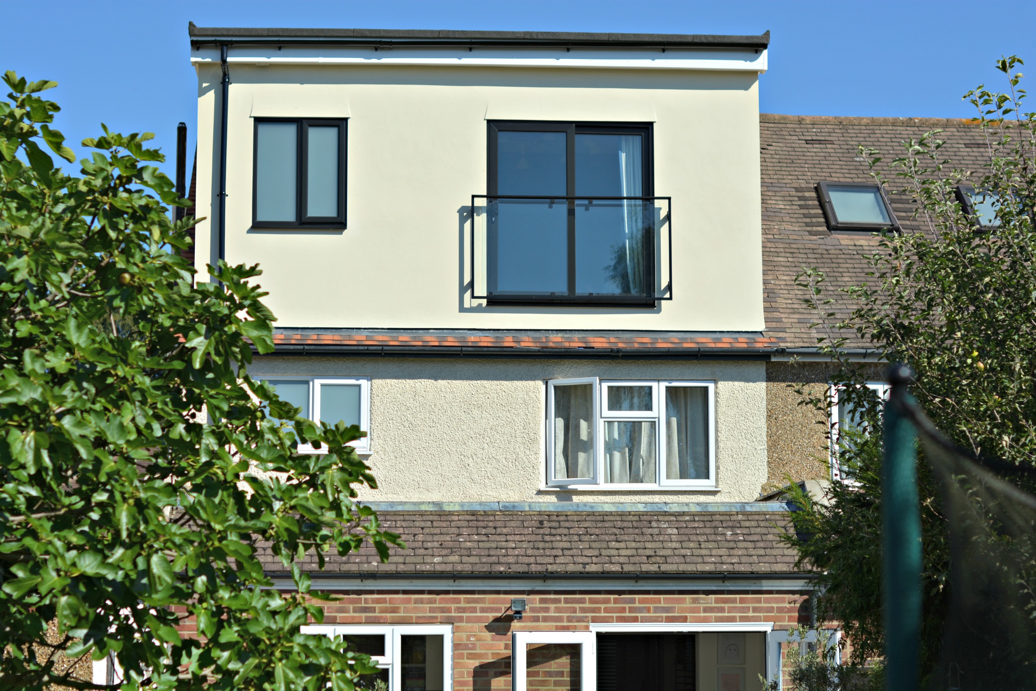
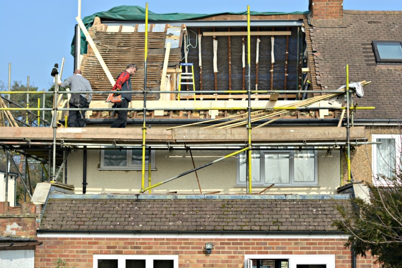
This is how the exterior of our new loft bedroom looked 6 weeks ago.
The existing loft room was certainly a good space, light & airy with two Velux windows & loads of storage along the eaves. Yet it was sorely lacking a loo.
With the children growing up fast one bathroom for the 5 of us wasn’t cutting it any more. That coupled with my menopausal midnight pee almost causing a tumble down the stairs, Mark & I agreed it was time to make our bedroom en suite. There was only one way to get the most space from what would be an expensive little project & that was by adding the largest dormer we possibly could. This achieves head height from the original footprint thus providing space for a decent sized shower room.
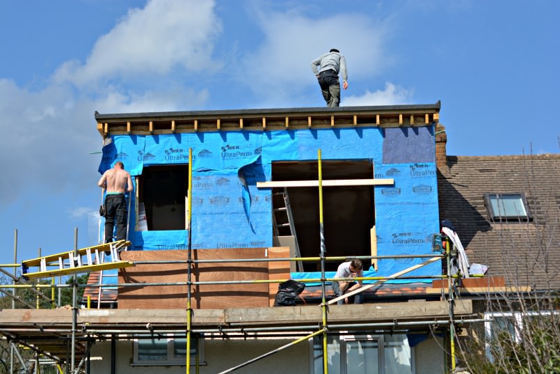
For 3 weeks following the removal of the existing walls we literally had half a roof, it was bloody freezing through the night let me tell you. We decided at the outset to re-tile the entire roof whilst we had scaffolding erected as it was probably about due anyway.
Hence so long with super charged air-con brrrr. I mean could it have been any wetter, windier & colder this March? Timing eh?
Oh well ’tis done now & looks lovely – Outside that is. Inside is a different story.
Time to decorate the loft bedroom
The race to finish is on – all trades on deck pushing to get hubby & I off the children’s bedroom floors. Both Mark & Kiara have been suffering terribly with their asthma from all the dust. Try as I have to keep it at bay, surprisingly dust finds its way down the stairs daily to settle on every surface. Anyone who has ever lived through building work (sounds like it could kill you – possibly might) will know how special it is.
Anyway I digress, back to the lovely decorating stage. Although it is lovely this part of the build, it hasn’t happened at the end at all. Far from it in fact, I had the vision in my mind from the very beginning & due to the nature of this particular room, have been decorating & prepping as I go.
Much to the frustration amusement of my builder the charming Noel. And I quote “Nothing you do is ever simple is it Michelle?”
Teeheehee shrugs shoulders lamely
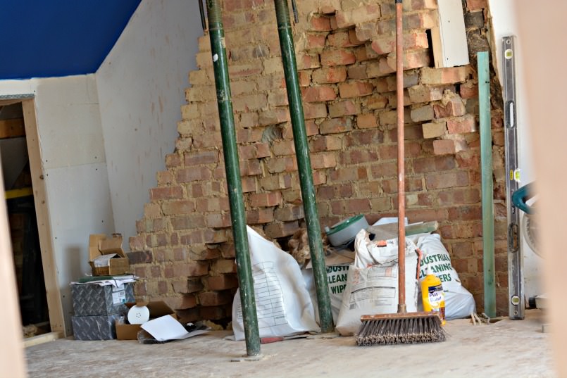
A perfect example of this was my desire for exposed brick & support post. The old plaster had to be carefully chipped off the chimney breast & will be painted with a special masonry sealant to halt further brick dust & crumbling. The support post that holds up the roof sits directly in front of my brick feature so I asked for the steel to be made “nicely” rather than your basic square that would usually be covered.
This will now become part of the industrial style feature
Instead of hidden behind plaster board in a somewhat obtrusive box-shaped pillar.
All sounds rather nice doesn’t it? Trouble is to prevent any scratches to the bespoke steel while building continues it needs to be fitted at the last possible moment. Therefore the floor will be laid last too & that particular section of ceiling can’t be plastered or painted either until the acro’s come down – see how complicated it becomes?
Speaking of the floor – I’ve chosen to do something you probably won’t have heard of before, which is exciting albeit a tad scary. Let’s save that story for my next deco post which will also include details of the incredible rug I found!
A Sliding door is an unusal choice for the Juliet balcony
The next issue to have us jumping through hoops was my request for a sliding balcony door instead of the popular french doors. As space is at a premium I really didn’t fancy two doors opening inwards, I could picture a large built-in wardrobe to the right of the chimney breast but imagined how annoying it would be having a door open in front of it. Again the other side would be equally awkward as I plan to have a desk there – Can you hear it now? bash bash bash every time “we” (not me-obvs) open the door against my painstakingly sourced mid-century office desk. No. Just no.
To me the solution was simple – SLIDE.
Having another bespoke item was one thing but asking for black UPVC was a whole new kettle of fish!
I actually would’ve liked aluminium frames however they worked out too expensive, I simply didn’t want to use the budget that way. I figured black plastic would be a good compromise because although it’s a lot cheaper it’ll still look smart & fit seamlessly in with my colour scheme.
After an initial hiccup of a misunderstanding – Er no I don’t want one side black & one side white – Nor do I want a white handle thanks – Causing a slight delay, they’re now fitted in place. Leading us nicely into the search for reasonably priced (again made to measure) curtains.
Yikes…
I decided rather than contrasting curtain colour to the Dulux dark blue walls I’d harmonize with it. BAHAHAHA what the hell was I thinking???
Yep you guessed it bloody stratospheric prices. Luckily I noticed Laura Ashley had an incredible 40% discount sale on all curtains. Unluckily it was the final day when I noticed it.
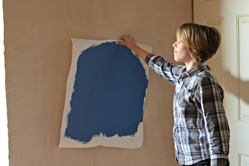
Colour matching should not be performed online. Off to Laura Ashley on Sunday I went with my trusty painted piece of paper in hand. I was thrilled to find the perfect linen blend called Bacall Sapphire.
Confident of my choice I went home to measure up & order my pinch pleats online. For anyone nervous of ordering ready-made curtains online I highly rate Laura Ashleys website. Straight forward & simply explained step by step guides made it an absolute delight, Oh that & the whopping £270 off from their sale!!!
I aim to give the impression of the door being as large as possible, tricking the eye into believing the entire room is a luxurious suite. I measured an extra 40cm to the width & 45cm to the length of the door. Fixing the pole slightly higher than most people would position it & allowing extra curtain length to puddle on the floor lends a little grandeur to the scale.

I’m a huge fan of Mid-century Modern design
Additionally I love to give new purpose to old objects & up-cycle wherever I can.
Not only does this add character to a space but more importantly it keeps perfectly usable & often beautiful unwanted items out of landfill. Sometimes all a thing needs is a lick of paint or a light sand down other times I like it just the way it is. I searched Ebay long & hard for my authentic bow tie sconce lights that will be hard wired either side of the bathroom mirror. I love that they’re slightly tarnished so a simple wipe over is all they need. Soon after I won these on Ebay the seller listed a truly sensational Stilnovo chandelier. I couldn’t afford to let it slip through my fingers so I made him a cheeky offer & to my complete surprise he accepted it! I will save it for the later reveal, trust me you wanna come back for that….

How to achieve a high end look on a tiny budget
I mentioned earlier my built-in wardrobe idea, here again was another proverbial magic trick to pull out of a hat. My vision of extra large walnut robes with matching low level cupboards along the eaves was fading as I realised I wasn’t actually a millionaire. Curiously this happens to me a lot – Go figure?
I began to consider a walnut “effect” even though I was skeptical of how convincing that would be.
After coming up against a few brick walls I remembered the incredibly accommodating kitchen company we used 8 years ago. Imperial Designs fitted what was essentially my bespoke design for an “off the peg” price, so gave them a call.
I hadn’t realised they fit custom bedrooms too!
Odd spaces require lateral thinking if you want to make the most of them. These loft conversions invariably end up with awkward storage vacuums & strange boxed in corners.
I didn’t want that, I wanted every inch usable & for it to appear deliberate. Again, this has to be done as you go in situ, none of it an afterthought.
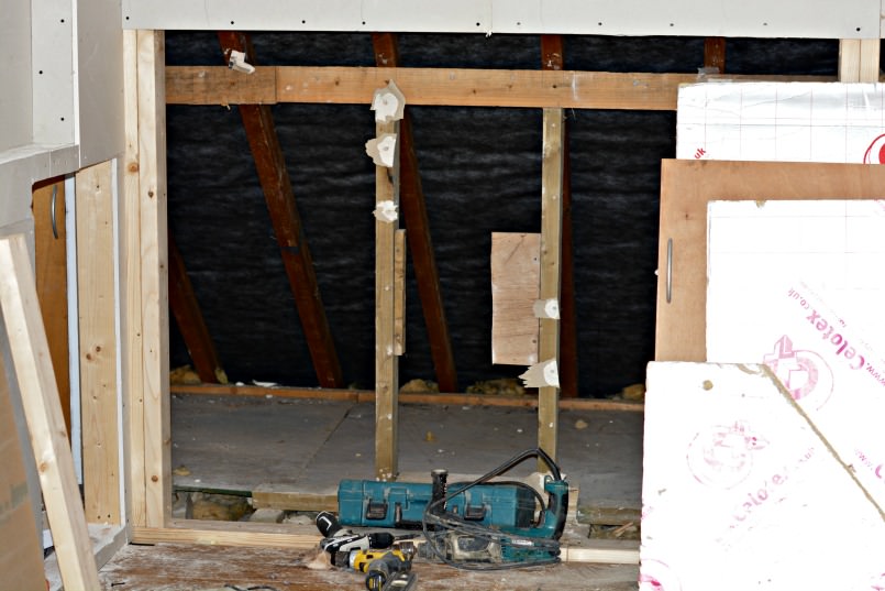
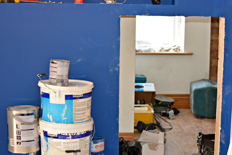
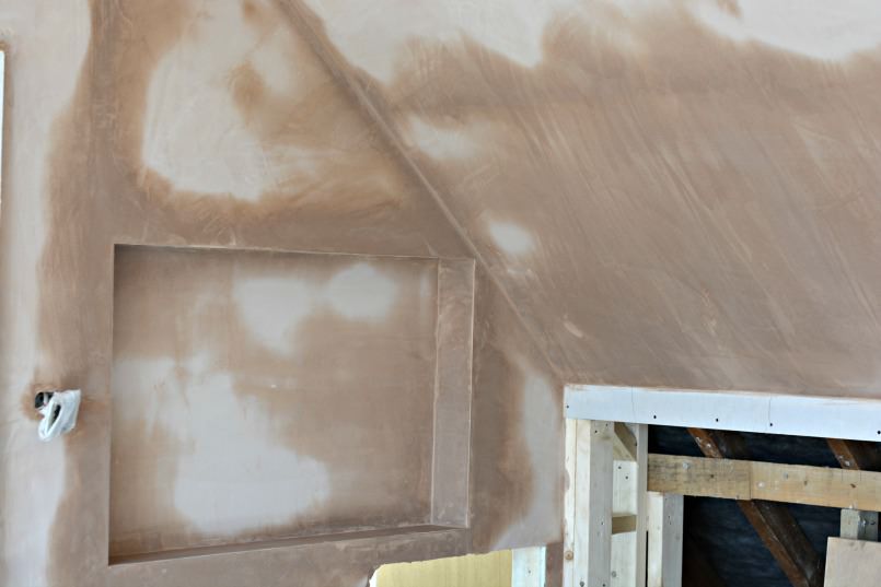
This brings me up to date of exactly where we are. Incredibly tomorrow the wardrobes & cupboards go in immediately followed by the “mystery” flooring.
The next week will revolve around the shower room – Tiling, fitting glass & my choice of a rarely seen finish for taps. BIG FUN STUFF!
Finally, painting both doors & skirting in the satin version of the Dulux matt we used on the walls – Sapphire Springs You may think that sounds over the top, after all we’re so used to seeing our doors & skirting painted gloss white. However the idea again is to give the impression of space by blending the wall all the way down to the floor. Effectively elongating the wall adding height.
“Wait” I hear you say – “Doesn’t dark colour make a room appear smaller?” Well here’s the thing, I believe that is a myth. I think dark walls make a room dark… that’s it. For a bedroom this could be an advantage, particularly for those of us who struggle to stay asleep. As for during the day, well there is a tonne of light coming through our south facing balcony door which should, in theory, create variation to the blue matt patina.
Additionally, not matching the white ceiling to the skirting removes the “top & tail” aspect which would shorten it’s appearance.
Anyway it remains to be seen to be proven, best you pop back next week to find out whether I’m right.
Dum dumdum duuuummm… If you’re curious for a hint of the design I’m going for check out my Pinterest board – Loft Inspiration.
I hope you’ve enjoyed my first deco post, Mx


Comments ( 8 )
Michelle
Wow Michelle, that’s one heck of a project! I know what it’s like living in a house whilst it’s being updated – cold and uncomfortable. At least is looks as if you can now see light at the end of the renovation tunnel. I look forward to seeing what happens next.
Michelle
retrochicmama
I think we’re all blissfully ignorant going in & forget all about it after it’s done. It’s fun to document this one though. I’m looking forward to the end result too heeheehee
xxx
Andy leathered
That looks like more than re decorate, more like a total rebuild. Good luck and hope it turns out awesome for you !
retrochicmama
Hmmm you’re not wrong Andy 😉
Abby@midlifecrisisnut
OMG – I look at this and can’t stop thinking: poor you! Ok, also lucky because you’re getting things done. But having mostly bad memories from any renovation we did, I swore to myself, next time I just take off for a few weeks and come back to a perfectly redone house etc. I just can’t stand it anymore, the dust, the total chaos, the drilling! I just can’t. I told myself that the only time somebody will be able to persuade me to continue on redoing the house, will be when I have a million sitting on my account, hire a designer, a team of builders and take off for Hawaii. But you, that’s a different story, I mean you are the designer in person. Just look at you Michelle, juggling all this with ease 😉 And still having the energy to write your beautiful blog. I admire you! xx Abby
retrochicmama
Or looking at it another way – I’m a complete control freak! Hahahaha
Thanks for your positive spin though Abby, you’ve boosted my confidence. Today that is no mean feat let me tell you arrrrgh…
xxx
sequinist
I can’t wait to see the end result. I adore dark coloured rooms: navy, red, teal, dark grey… I SAY that, but every single surface in our house is white! I can’t wait to see the end result, it sounds gorgeous. I love the light fittings and handles too, the gold/brass will really work well with this blue. Having been through the stress of several renovations, I know your frustrations, but you’ll look back and laugh one day, and in the meantime, you can entertain us with tales of renovations! xx
retrochicmama
That’s the beauty of building work, it’s a bit like giving birth. As soon as you see the gorgeous end result you forget entirely everything that hurt so bad.
X